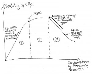
This graph (which will get bigger if you click on it) comes courtesy of the scientist in me (believe it or not, I have a PhD in engineering). The point is to show one of the things I learned from being No Impact Man–the relationship between quality of life and the consumption of our planetary resources, by which I mean everything from emitting greenhouse gases to putting toxins in the water.
Anyway, the overarching point of the image is to show, first of all, that there comes a point where using more resources actually reduces your quality of life.
Think, for example, of just before I started the No Impact year. I lived life as a stressed-out, New York resource hog. Every night we ate take-out for dinner, plopped ourselves in front of the TV because we were too tired to do anything else, and bought stuff and trips on credit cards. The result was that we we lived pay check to pay check, stressed about money, ate unhealthily and never exercised. You get the point.
This is Zone 3 on the graph. Zone 3 represents a lifestyle where your life and your mind are crowded with what you have and what you do and you are overwhelmed. In this area, the more you have and the more you do, the worse you feel.When we consciously began using fewer resources, we found ourselves with more time to spend together, eating more healthily, and less worried about money. We moved from right to left and up the curve. In other words, consuming less gave us a better quality of life.
In Zone 1, which is where we lived in the last months of the project, with no lights and no electricity, we found that we had restricted our resource use to the point where we were making ourselves unhappy again. Not having light after 4:30 made me depressed and caused us stress because we didn’t have the daylight we needed to get our jobs done. Doing laundry by hand is hard work and time consuming.
Zone 2 was the middle ground, the place I want to live. The interesting thing about Zone 2 is that beyond a certain amount of resource consumption (at the top of the curve) there is very little effect on quality of life. In other words, it is an area where there is just no reason to consume more resources. Zone 2 is the area of waste and habituation.
It’s the area of waste because, for example, leaving unused lights switched on wastes resources but causes no improvement in life quality. It is the area of habituation because this is where you get used to having or not having things and they don’t, once you’ve acclimatized, make much difference to your happiness.
This would include, in our case, not using the air conditioner. Using it would have consumed a lot of electricity. Not using it, once we’d adjusted, had very little effect on our happiness.
Finally, there is the point on the graph which I have marked as”the goal.” This point, to me, is the Holy Grail of balance between quality of life and resource conservation. This is the place where you get to go out to a restaurant with friends once or twice a week, but you don’t waste resources in a way that doesn’t even improve your lifestyle by, say, eating out every night because you’ve fallen out of the habit of grocery shopping.
This point, “the goal,” is really just the place where you are really conscious of what you use. You don’t take things for granted. You understand that your actions have consequences for other people and the planet. It is the point between asceticism and waste, between self-denial and self-indulgence. It is the place of balance.